Choosing the Right Picture Frame: A Guide to Complement Your Artwork
Choosing the right picture frame is an essential step in showcasing and preserving one’s artwork. It’s not just about aesthetic appeal; the frame also protects the art from environmental factors. Here are the key factors they should consider.

Identify the Artwork Style and Size
When selecting a frame, one must consider both the style and size of the artwork. Whether it’s a delicate watercolor, a bold oil painting, or a simple print, the artwork’s style dictates the appropriate frame style. The artwork’s physical size should lead to a proportional frame choice to ensure the piece remains the focal point.
Table of Artwork Style to Frame Style Examples:
| Artwork Style | Suggested Frame Style |
|---|---|
| Traditional or Classic | Ornate Wood Frame |
| Modern or Contemporary | Sleek Metal Frame |
| Abstract or Textured Artwork | Simple Frame with Texture |
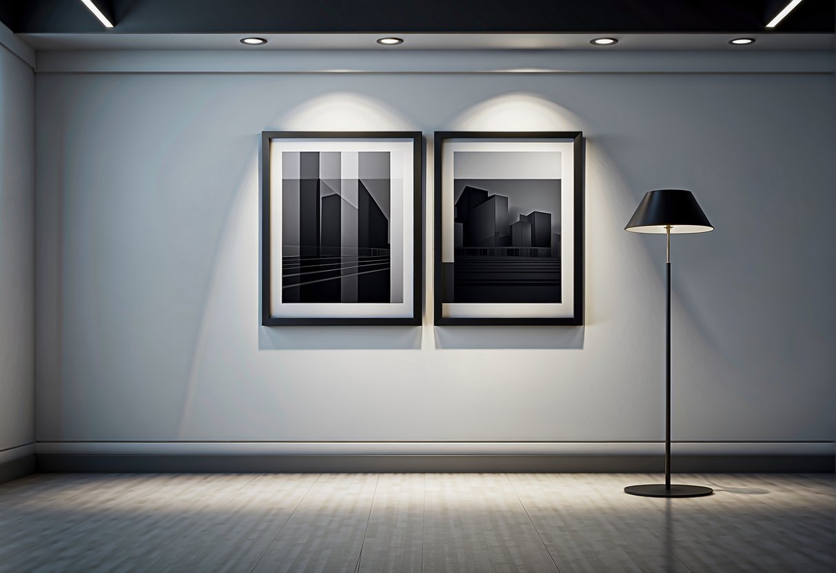
Selecting the Right Frame Material
Frames are typically made of wood or metal. Wood frames offer a classic look and are versatile for a variety of artwork styles. They come in numerous finishes and can be carved with details to complement traditional art. Metal frames tend to suit modern art due to their clean lines and minimalist look. They should choose a material that enhances but doesn’t overshadow the artwork.
List of Considerations for Frame Material:
- Durability: Wood frames are sturdy, but metal frames can offer a lighter, more modern touch.
- Aesthetic: Match the frame to the era and feel of the artwork; antique for traditional and slim metal for minimalist pieces.
- Environment: Consider where the artwork will hang; humidity can affect wood, while metal is more resilient.
Color and Texture Considerations
The frame’s color and texture can either complement or detract from the artwork. They shouldn’t necessarily match the frame color exactly to the predominant colors in the piece, but rather aim to enhance the overall tone of the artwork. Textured artwork often benefits from a simpler frame, allowing the piece itself to stand out.
Key Points on Color and Texture:
- Choose a frame color that resonates with the tones of the piece, not necessarily matching the most dominant color.
- For textured artwork, opt for a frame that doesn’t compete with the art’s tactile qualities.
Framing Techniques and Design Options
When selecting the ideal frame for artwork or photos, it is essential to consider not just aesthetics but also preservation and display quality. The right combination of matting, glass, and frame choice enhances both the piece and its longevity.
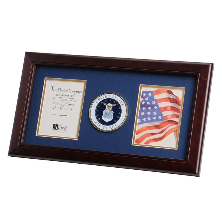
Choosing Mats and Borders
Mats serve a dual purpose: they protect the artwork by preventing it from touching the glass and they enhance the visual appeal by framing the art with a complementary border. Choosing the right mat is crucial; a too-busy mat can distract from the art, while the right color palette can highlight the artwork’s colors. Neutral mats often work well, but occasionally a splash of color can bring out subtle tones in the artwork.
Glass and UV Protection Choices
Glass choice impacts both the clarity of the artwork and its protection from UV rays. Art glass with UV protection is recommended, as it prevents colors from fading over time. However, one might choose non-glare glass for works displayed in bright environments to reduce reflection and improve visibility.
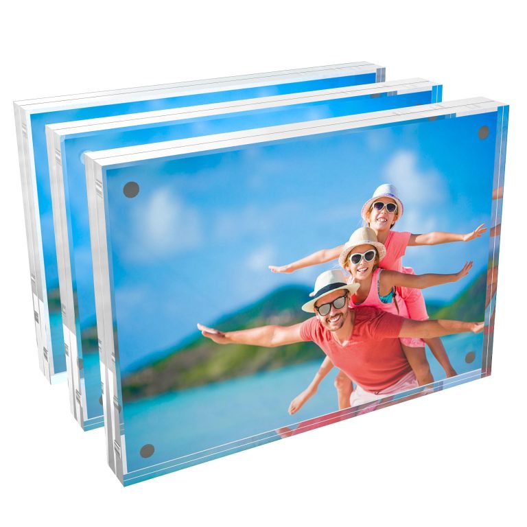
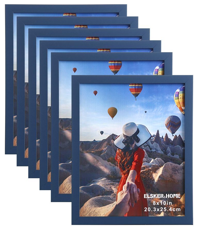
Custom vs. Ready-Made Frames
The choice between custom and ready-made frames often comes down to the specific needs of the artwork and the individual’s preferences. Custom frames provide the perfect fit and an opportunity to match the frame style exactly with the artwork. In contrast, ready-made frames come in standard sizes and a variety of styles, offering both convenience and cost-effectiveness. However, they may not always provide the same level of fit or finish as a bespoke option.
Integration with Interior Decor
When selecting picture frames, one should aim for a harmonious relationship between the frames and the interior decor. The choice of frames can either enhance the existing room decor or provide an appealing contrast that draws attention.
Complementing Furniture and Space
Choosing a frame that echoes the materials or colors of the furniture within a space adds a layer of sophistication to interior design. For instance, a frame with a wood finish can complement wooden furniture, tying the room’s design together. When considering the space, a minimalistic, slim frame helps maintain a sense of openness, particularly in rooms where the furniture has a more delicate or modern aesthetic. It’s important for the frame to balance with both the furniture and space to avoid visual overstimulation.
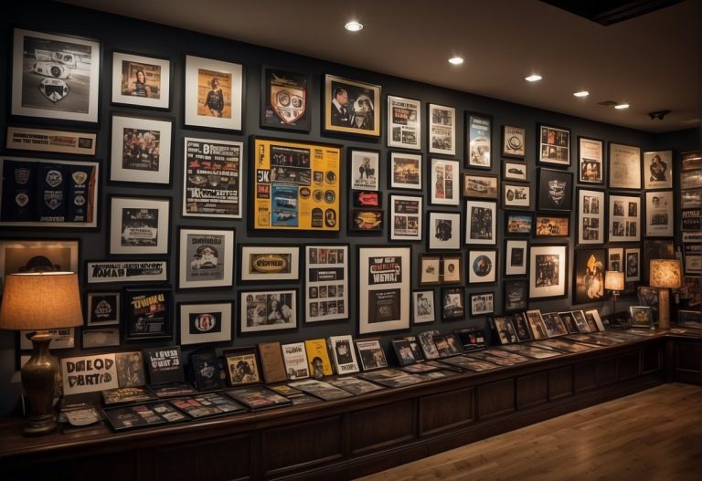
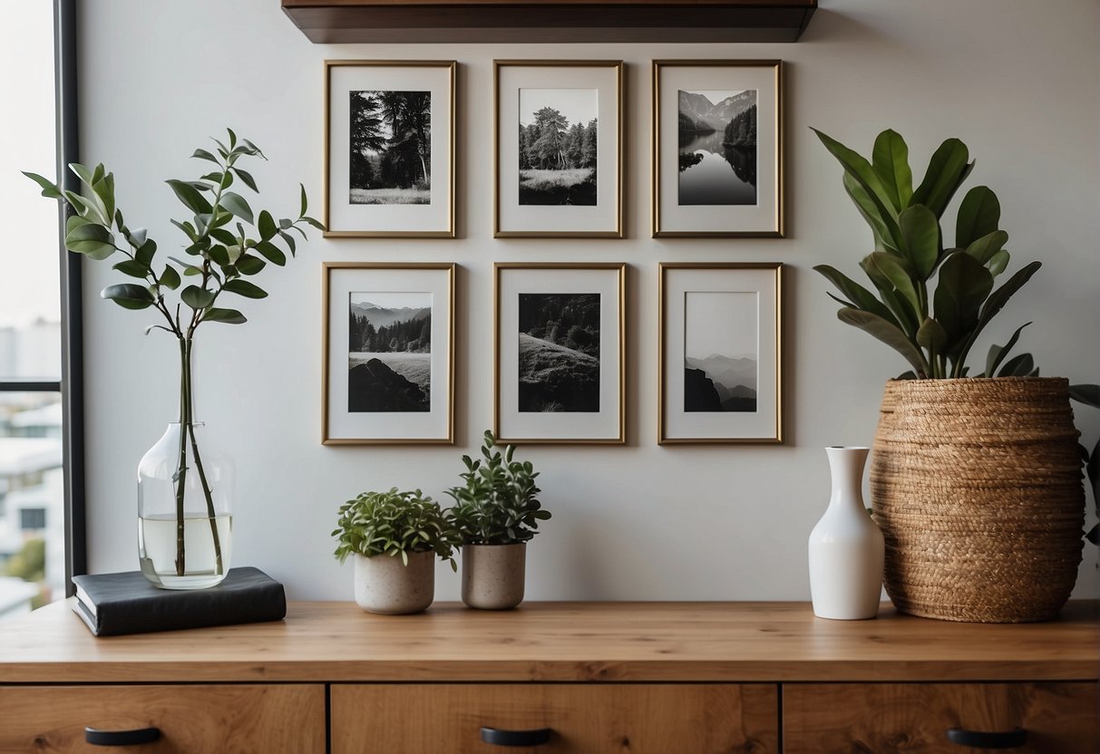
Creating a Cohesive Gallery Wall
For a gallery wall, cohesion is key. One can achieve this by using frames of the same color or material while varying the size and orientation for interest. Alternatively, mixing frame styles works if there is a consistent element, such as color or subject matter, in the prints or photographs. Lighting plays a crucial role in a gallery wall’s presentation, helping to unify the collection and enhance the visual connection between the gallery and the room decor. When thoughtfully curated, gallery walls serve as a focal point, reflecting the aesthetics of the interior design and personal style.
Practical Tips for Frame Selection

When selecting a picture frame, one should consider several factors to highlight their artwork or photograph effectively. Here are some guidelines to assist in making the best choice:
- Art Style: Align the frame with the style of the art. For instance, modern art might benefit from a sleek, minimalist frame to complement its aesthetic.
- Economical Options: Seek out frames that offer both quality and value. Frames such as the Nielsen #11 & Radius Nielsen #58 provide an economical yet stylish choice without overstressing the budget.
Color Analysis:
- Dominant Colors: The frame color should harmonize with the dominant colors of the artwork.
- Neutral Frames: Choose a neutral frame for a versatile option that can blend with various color palettes.
Frame Features:
- Floater Frames: Ideal for canvases, floater frames create the illusion that the art is floating within the frame.
- Rabbet Depth: Ensure the frame’s rabbet depth can accommodate the thickness of the art and any matting.
Environment Considerations:
- Lighting: Consider the lighting conditions where the art will hang. Glass with UV protection is recommended to safeguard against fading.
- Design: Frames should also complement the existing decor and design elements of the space.